Touch The Chilis
Adrian J Cotterill, Editor-in-Chief
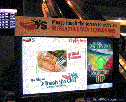
When our researchers first came upon this, we looked at in in the office and were convinced it was from Eastern Europe (see our story “Prague Vodafone Store Needs Help” before you judge us on that comment) but it turns out it’s in Orlando airport in Florida!
Steve Portigal from Portigal Consulting firmly hits the nail on the head on his blog when he writes…
A touch screen looks like any other monitor; designers have not created anything in the physical form that denotes interactivity. It falls to the content (what is on the screen) and the context (where is the screen placed) to invite people to touch. In this case, they’ve chosen to add an external static sign to indicate what you should do.
This is in an airport, so informational rather than advertising content might be a more natural draw for interacting (seriously, an interactive menu experience?, and having this thing sitting near an escalator doesn’t make a lot of sense; it’s not a place to linger.
Here we have another example of post-design, fixing a problem in the original design by adding on another piece. Seeing that added instructional text made me wonder how we typically know that a screen is one that we can touch and interact with. It’s an interesting opportunity for the hardware manufacturers to create some visual language that can help with that invitation.
Adding a cardboard surround to the screen is rather poor. It’s great that we are now starting to see a lot of non-industry design firms critique digital signage deployments.

Follow DailyDOOH