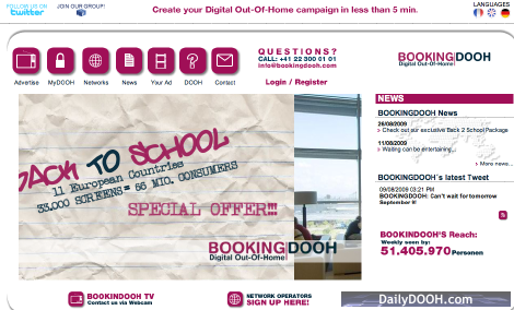
New BOOKINGDOOH L+F
We mentioned before that we didn’t like the new BookingDOOH logo (it shouts at you) and we hate for example, the fact that in their publicity they refer to themselves as BOOKINGDOOH – seriously someone has not thought through what happens when the logo gets taken into text. CamelCase was one thing but all UPPER CASE is so wrong.
Anyway, we had a sneak preview of their new web site (shown above) and that works. We really like their new layout. Much cleaner, better use of just a few colours, it’s a bit pink but we like simple and clean and it is and looks simple and clean.
BOOKINGDOOH’s communication with the media buyers and network operators is improved as well; ability to communicate with them through video messages and the website has been linked to their twitter and facebook accounts as well.


Follow DailyDOOH